
Vet2Go
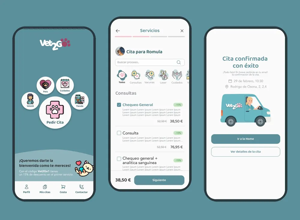
We redesigned Vet2Go’s booking experience, not just the interface: we turned a complex, rigid booking process into a clear and flexible one, ready to book an appointment for one or several pets.
- Client
- Vet2Go
- Industry
- At-home vet care
- Duration
- 1–2 months
- What we did
- UX audit · Flow redesign · Design system
Booking an appointment should
be simple.
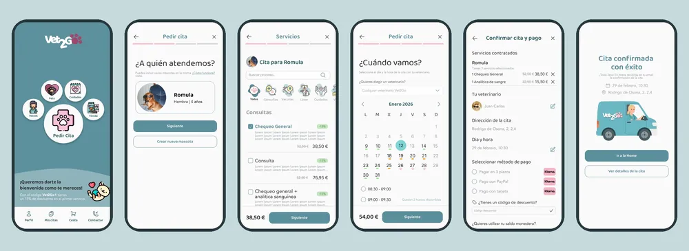
Vet2Go is an app for booking at-home veterinary services. Each booking chains together five decisions: pets, services, address, date and time, and payment.
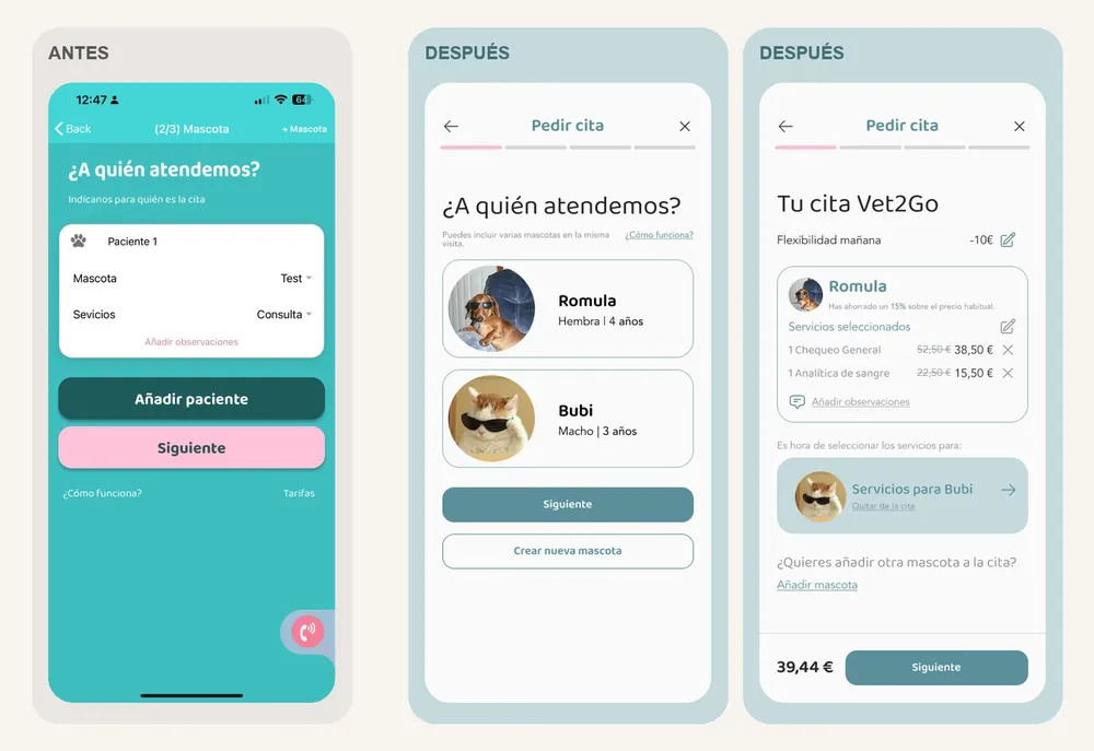
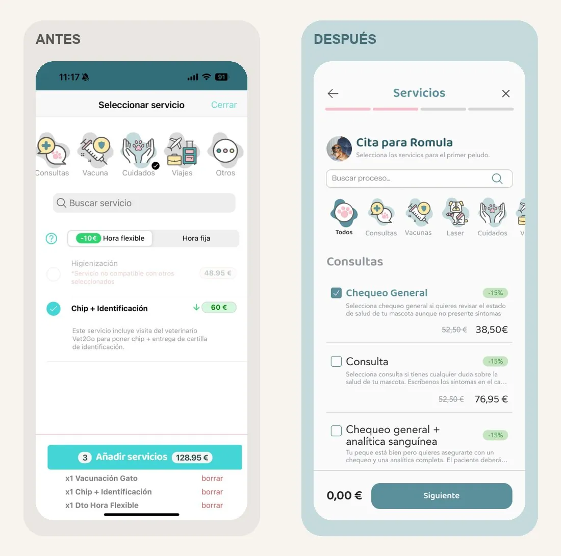
The problem: the catalogue brought together lots of services, but didn’t help people understand what each one included or why to choose it. And the flow was designed for a single patient: to book for another pet you had to repeat the whole process.
Research
and diagnosis.
Before moving pixels, we needed to understand where the experience broke down:
- Heuristic audit to locate friction on every screen.
- Interviews to see how pet owners book and where they hesitate.
- Analytics to flag the steps that deserved attention.
- Benchmark of booking and review patterns.
- Information architecture: one step, one decision.
- Prototype and tests to validate the journey before the final design.
The diagnosis pointed to three areas: clarity and guidance, control and flexibility, and booking complexity. The challenge wasn’t to reduce options, but to help people understand them, decide and stay in control throughout the journey.
A catalogue that
helps you choose.
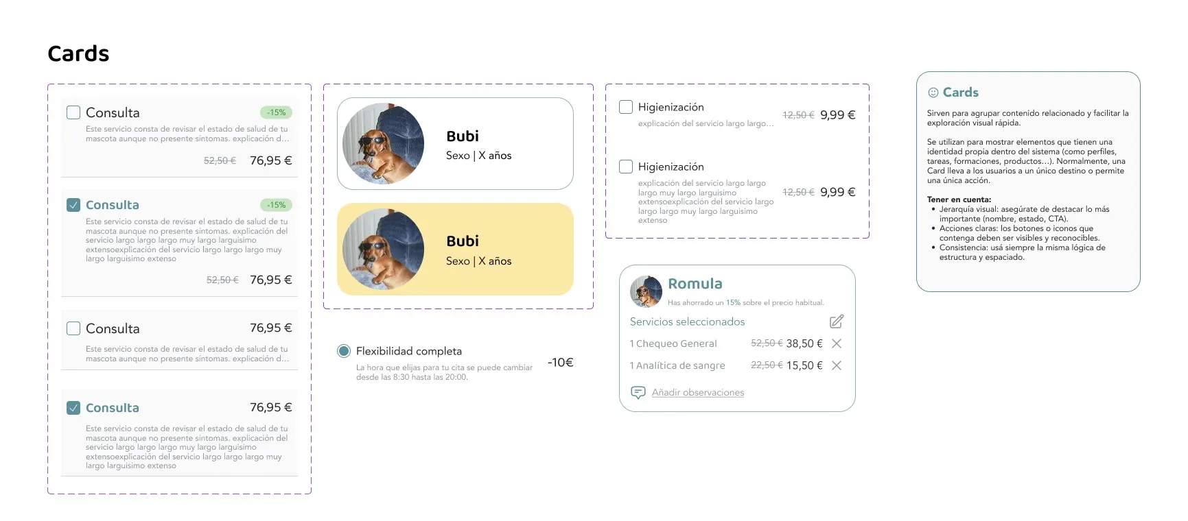
The same services, with a different organisation and hierarchy: categories with icons, each service with its name, what it includes, price and discount, all linked to the pet (“Appointment for Romula”). Extras appear when you choose a main service, and the basket becomes a summary per pet, editable line by line.
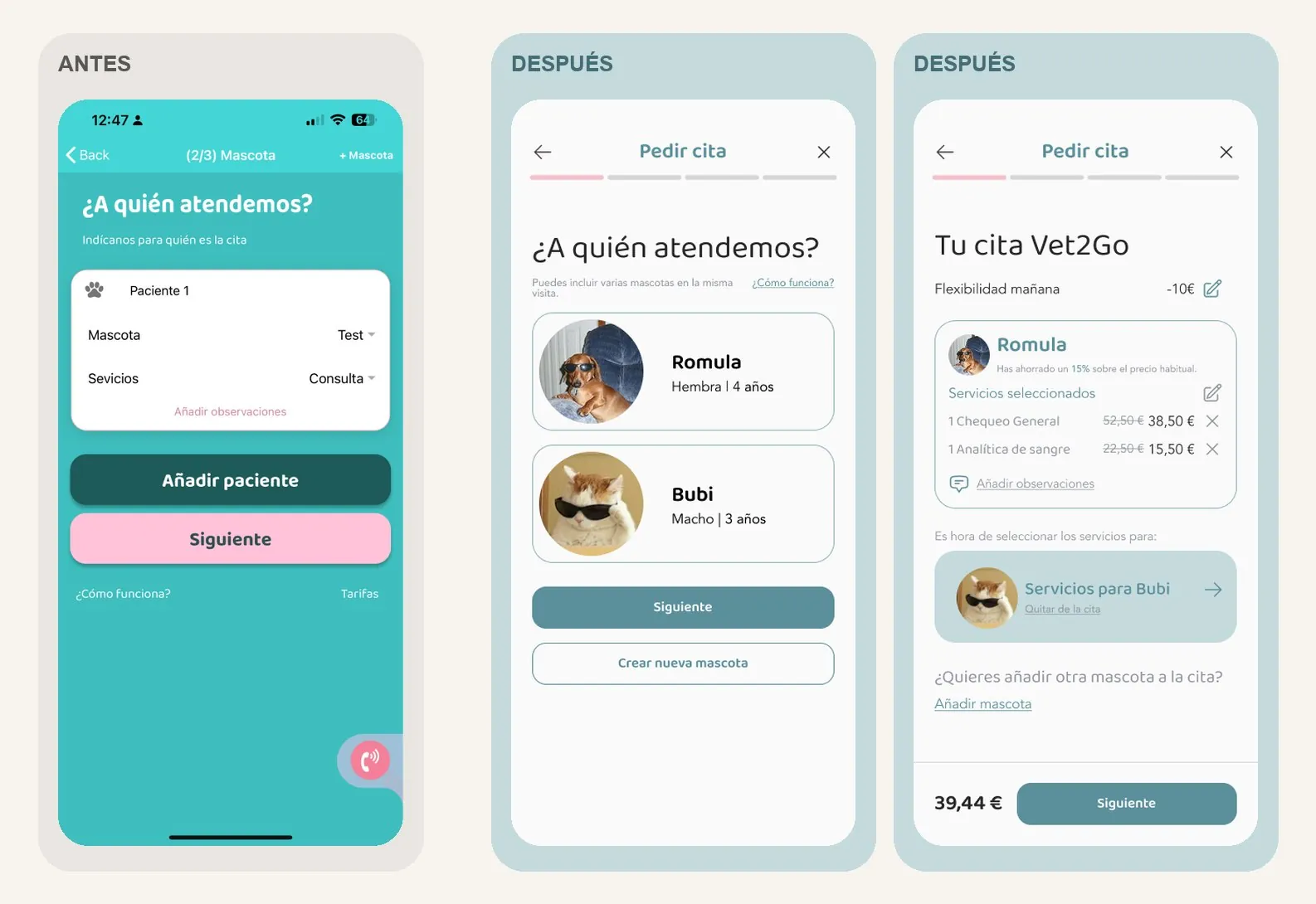
Every furry friend, their own care.
One single appointment.
Many clients had more than one pet and had to repeat the booking for each one. We redesigned the flow to add several patients in the same journey, choose the services for each one and review everything in a single appointment.
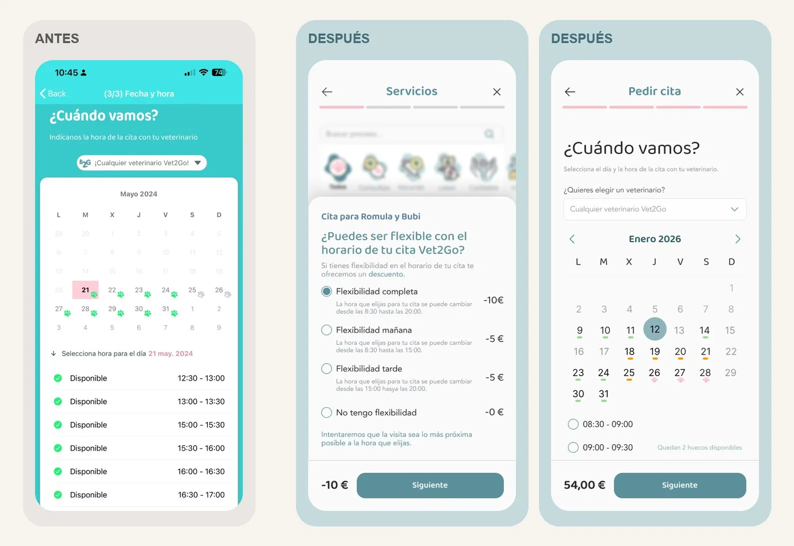
Flexibility,
date and time.
Time flexibility moves out of the services list into its own step, with four explained options and their discount. The calendar takes centre stage: big days, availability markers and only the useful slots for the chosen day, with a warning about remaining slots.
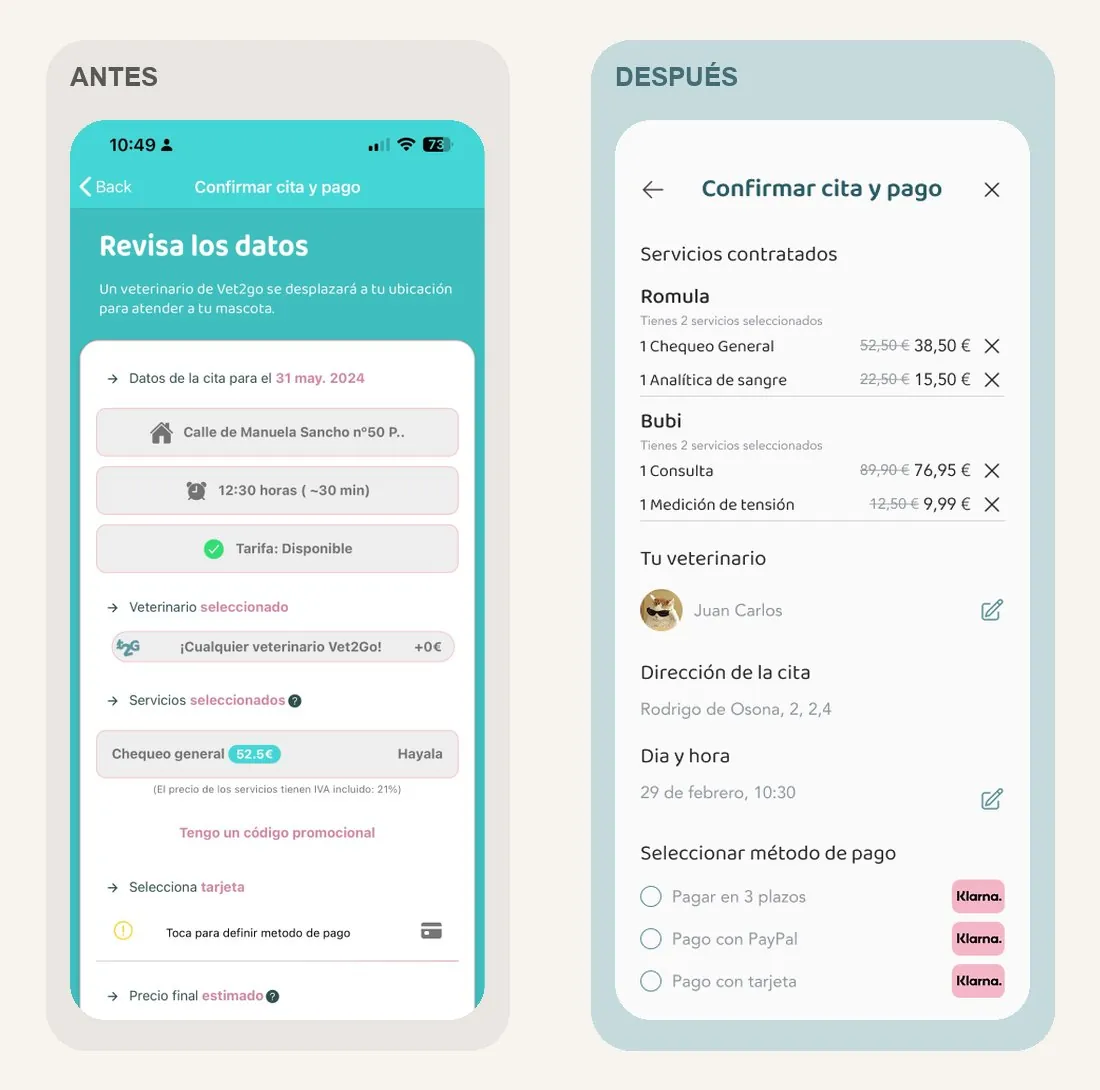
Confirming
means reviewing.
Grey fields that looked like buttons become a real review of the appointment: services per pet with their price and an option to remove them, vet, day and time editable in context, and payment and breakdown before the final button.
A system
to grow.
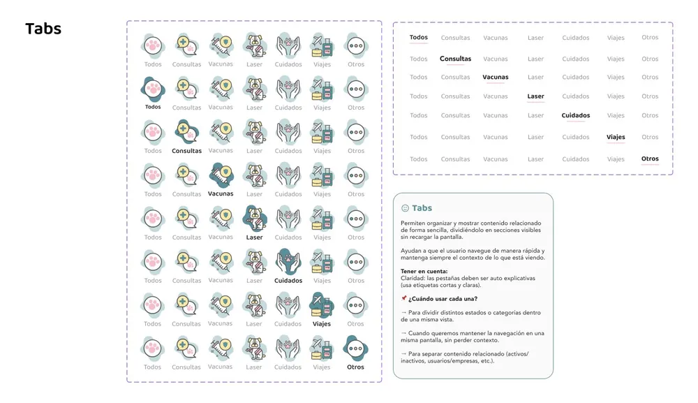
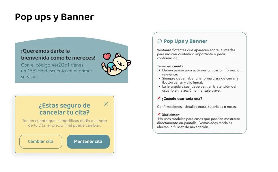
We documented the components with their states and usage rules —cards, steps, booking footer, headers, tabs with icons, modals, inputs and dropdowns— so every pattern always means the same thing and the product grows without slipping back into inconsistency.
#C4DADD#5A8F9B#446D76#F7BFCA#FDE8A5#585858
Baloo Bhai for headings and Poppins for body text; never black, never italics. And a friendly but professional tone: “furry friends”, not pets; “guardians”, not owners.
The
result.
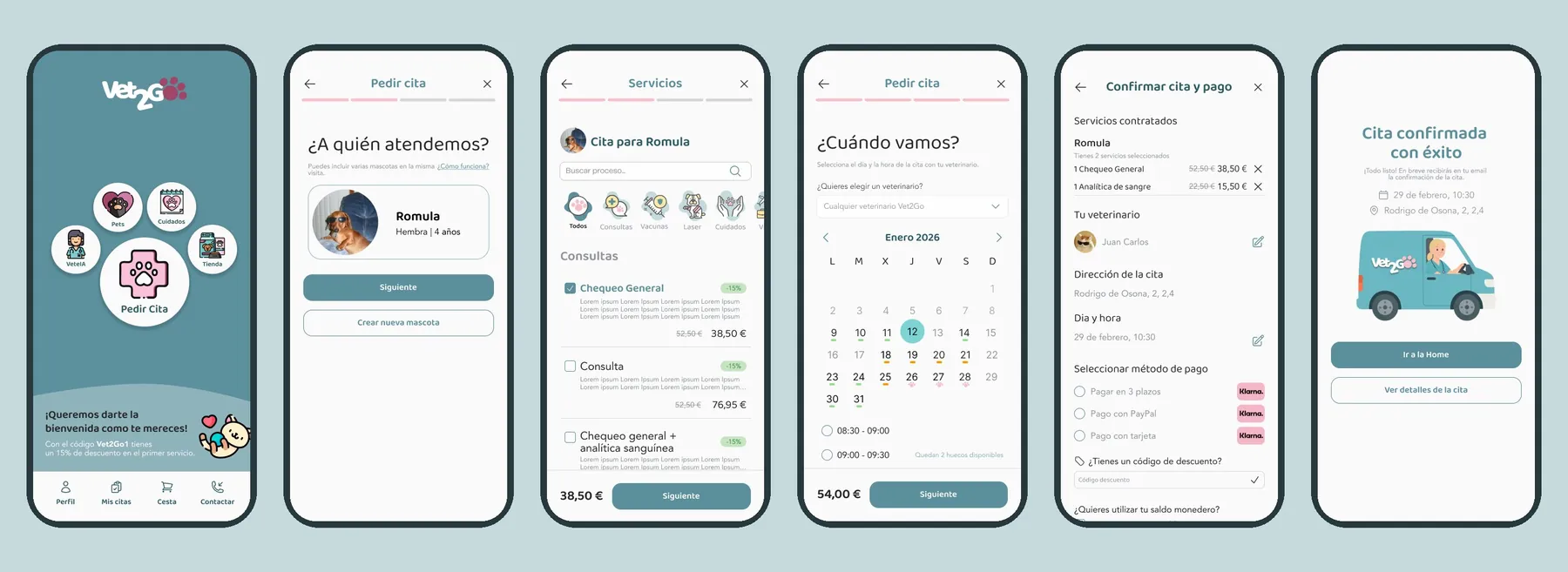
The redesign of the main flow was implemented: today you can organise services for several pets in a single appointment and review every decision before confirming. From a rigid process to clearer, more flexible booking.
Want
something like this?
Tell us about your project and we’ll reply within 24 hours.