Branding · Nutrition
Laura Ortega
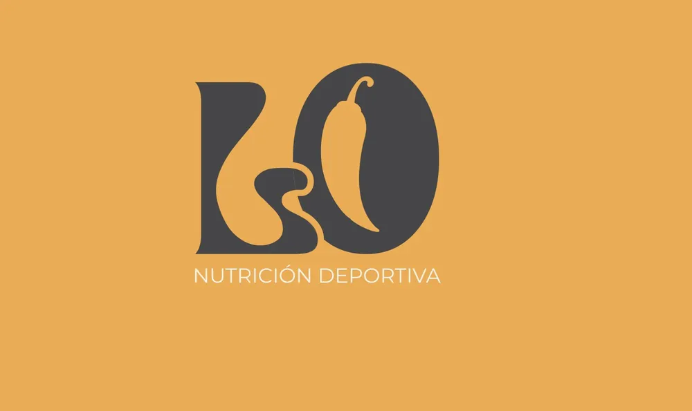
Rebranding for a sports nutritionist. The pepper as a symbol.

- Client
- Laura Ortega
- Industry
- Sports nutrition
- Where
- Valencia · 2025
- What we did
- Rebranding · Social media templates · Business card
The challenge
Laura wanted a brand that was elegant yet warm, that connected with an audience aged 22 to 35 and didn’t look like the typical cold, clinical nutrition brand.
What
we did.
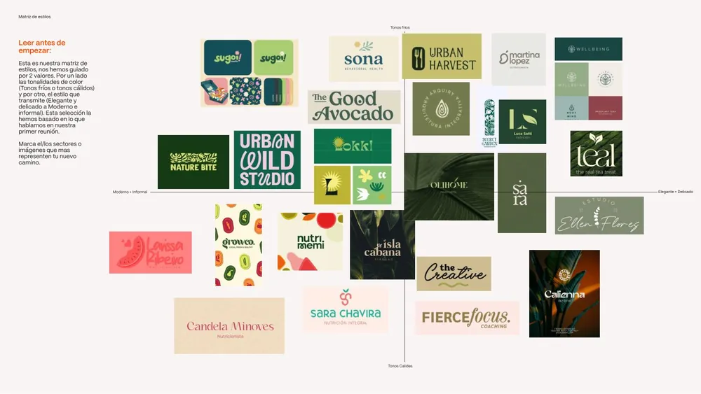
- We started with a style matrix where Laura marked what represented her and what didn’t.
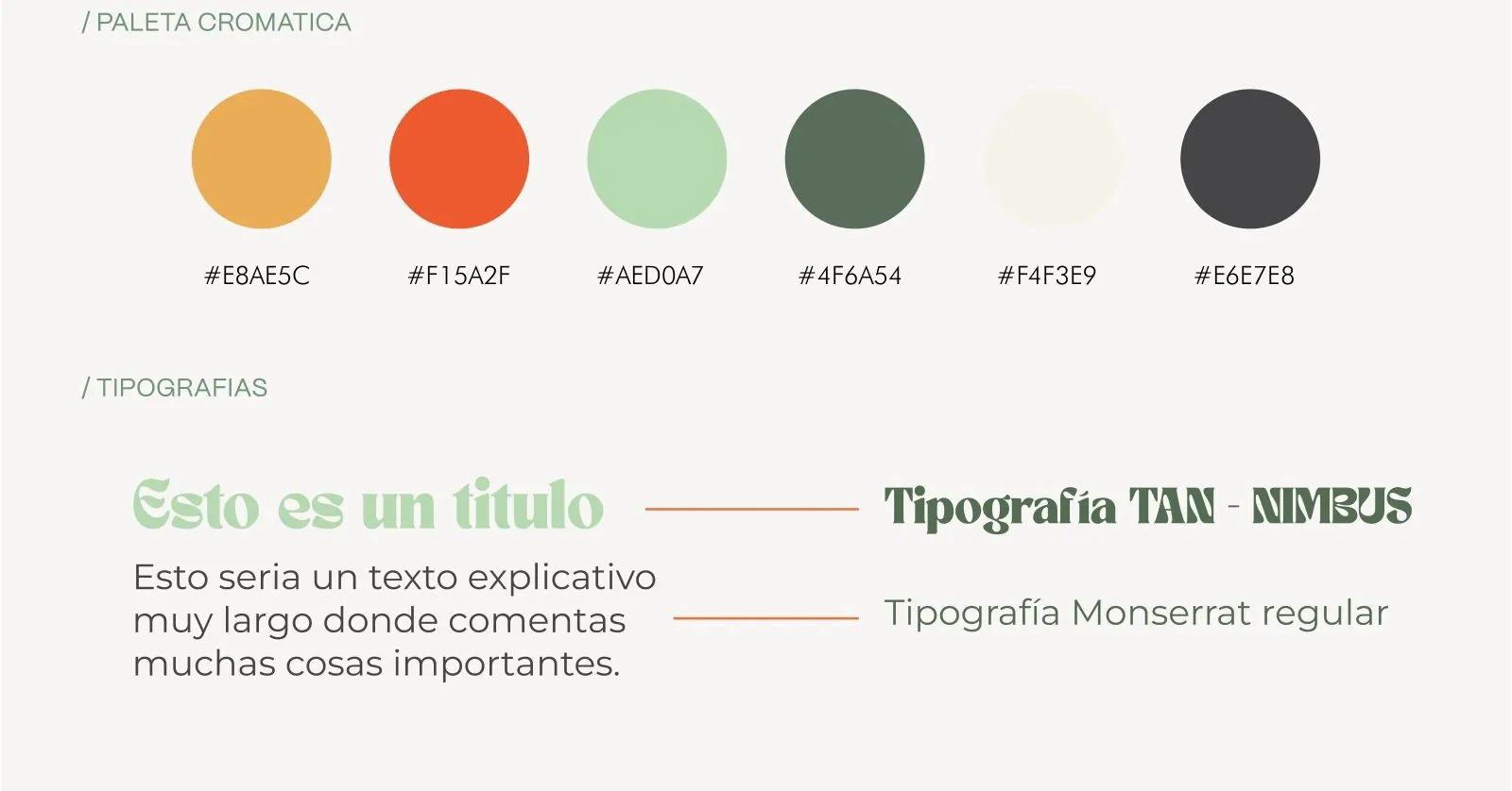
- Colour palettes to choose together: the greens won.
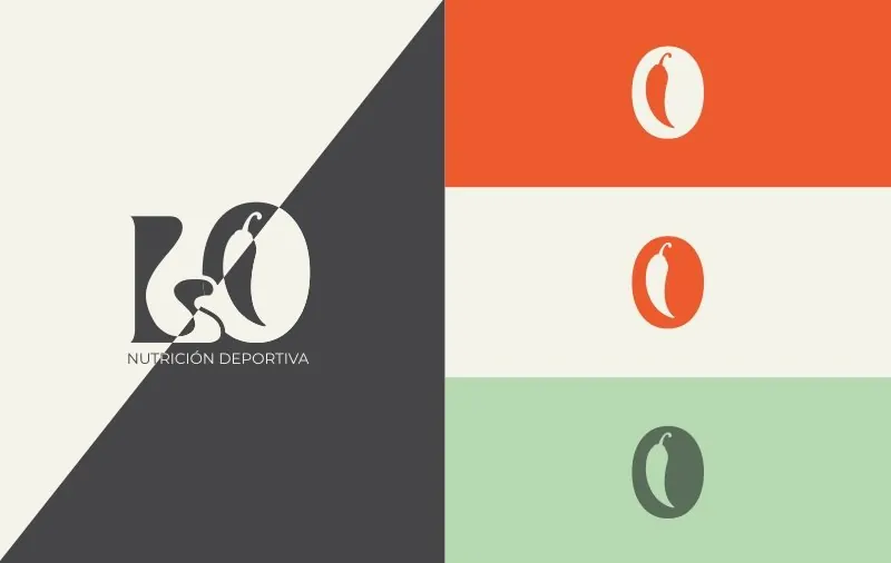
- A complete brand system: logo, LO monogram with the pepper as a symbol, a 6-colour palette, TAN Nimbus and Montserrat typefaces, and a pepper pattern.
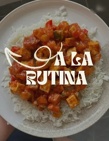
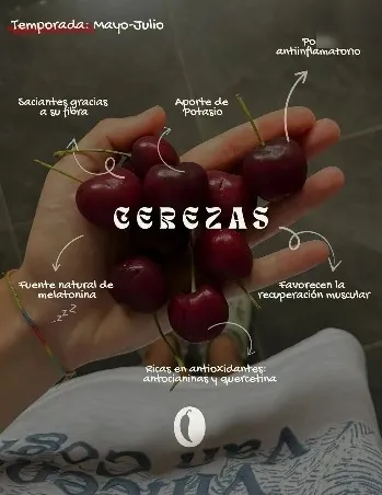
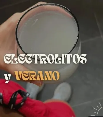
- Instagram templates and business card: the brand applied to her weekly content.
Results
5.0★rating on Google
8–10weeks of project
6colours, 2 typefaces and a custom pattern

Want
something like this?
Tell us about your project and we’ll reply within 24 hours.